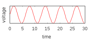
It looks like you are confused about what these graphs represent. Here's the diagram you used in the question:

Probably, this diagram is intended to be interpreted with the horizontal axis being time, and the vertical axis representing voltage or current.
Using that same representation, then SSB looks like this:

For comparison, AM looks like this:

and FM looks like this:

In fact, they all mostly look the same. Why? In these images, we can only see about 5 cycles of the carrier. While the carrier is modulated somehow, the highest frequencies in the baseband signal (your voice) are usually much lower than the carrier frequency. So although the amplitude or frequency may be changing, we can't see any significant changes over such a short span of time.
These images, because the X axis represents time, are said to be time domain representations.
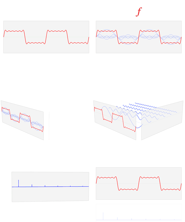
However, one thing we know from Fourier analysis is that we can also represent any periodic signal in the frequency domain. We can represent that graphically by making the Y axis frequency instead of time.
To illustrate, we can look at a square wave in the time domain ($f$), and see how it can be represented in the frequency domain ($\hat f$):

"Fourier transform time and frequency domains (small)" by Lucas V. Barbosa - Own work. Licensed under Public Domain via Wikimedia Commons.
We don't usually use square waves in radio communications because they have power spread over a wide range of frequencies. A square wave at 1 MHz also has energy at all the odd harmonics, 3 MHz, 5 MHz, 7 MHz, and so on. This would cause a lot of interference, since each station is typically allocated just a small channel in which to transmit. Broadcast FM, for example, is allocated a channel 200 kHz wide, and all their transmitted power has to fit in that. For example, from 89.7 MHz to 89.9 MHz.
Consequently, most transmissions look more or less like sine waves, since a sine wave has all its power at exactly one frequency. Then we vary the amplitude or frequency of this wave to carry information, but at a relatively slow rate compared to the frequency of the carrier.
Once you understand the concept of looking at signals not as a function of time, but as a function of frequency, then it is easy to say what SSB looks like: it looks just like the baseband signal (your voice), but shifted up in frequency to wherever the transmitter is tuned.
As an example, a whistle is approximately a pure sine wave. So if you whistle at 1kHz into the microphone, and the transmitter is tuned to 1MHz, then what you will see transmitted is a pure sine wave at 1.001 MHz (1 MHz + 1 kHz). If you make no sound at all, then nothing is transmitted.
If you get two people whistling at different frequencies, say 1 kHz and 2 kHz, then what you will see is the sum of two sine waves, one at 1.001 MHz and another at 1.002 MHz. Because these two frequencies are so close together, if we view it on any timescale where we can see the individual oscillations of the transmitter, it will just look like a sine wave.
So it doesn't really make much sense to think about what SSB looks like in the time domain, and consequently, most of the graphics you see represent the signal in the frequency domain.

